Case study · Independent product
 FoodsPlans
Designed, specified, built and shipped alone
A meal planner I built alone in four months. The case is really about the working method — a written functional spec as a contract for a code-generating model.
Context
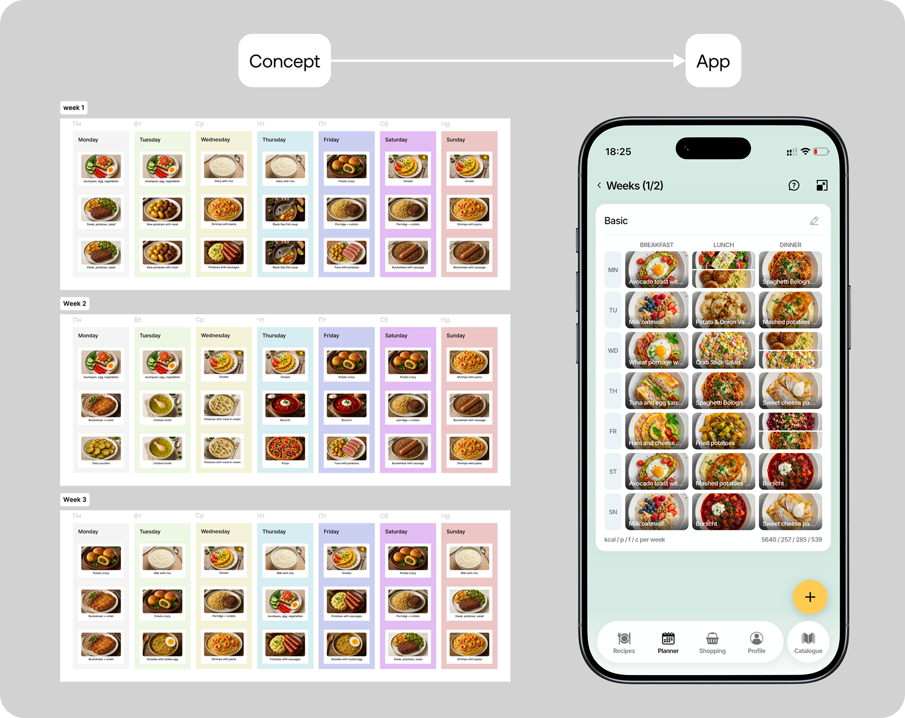
I was planning my own week of meals in Figma — literally a table with cells. It worked, which was the problem: a spreadsheet was outperforming the apps built for this.
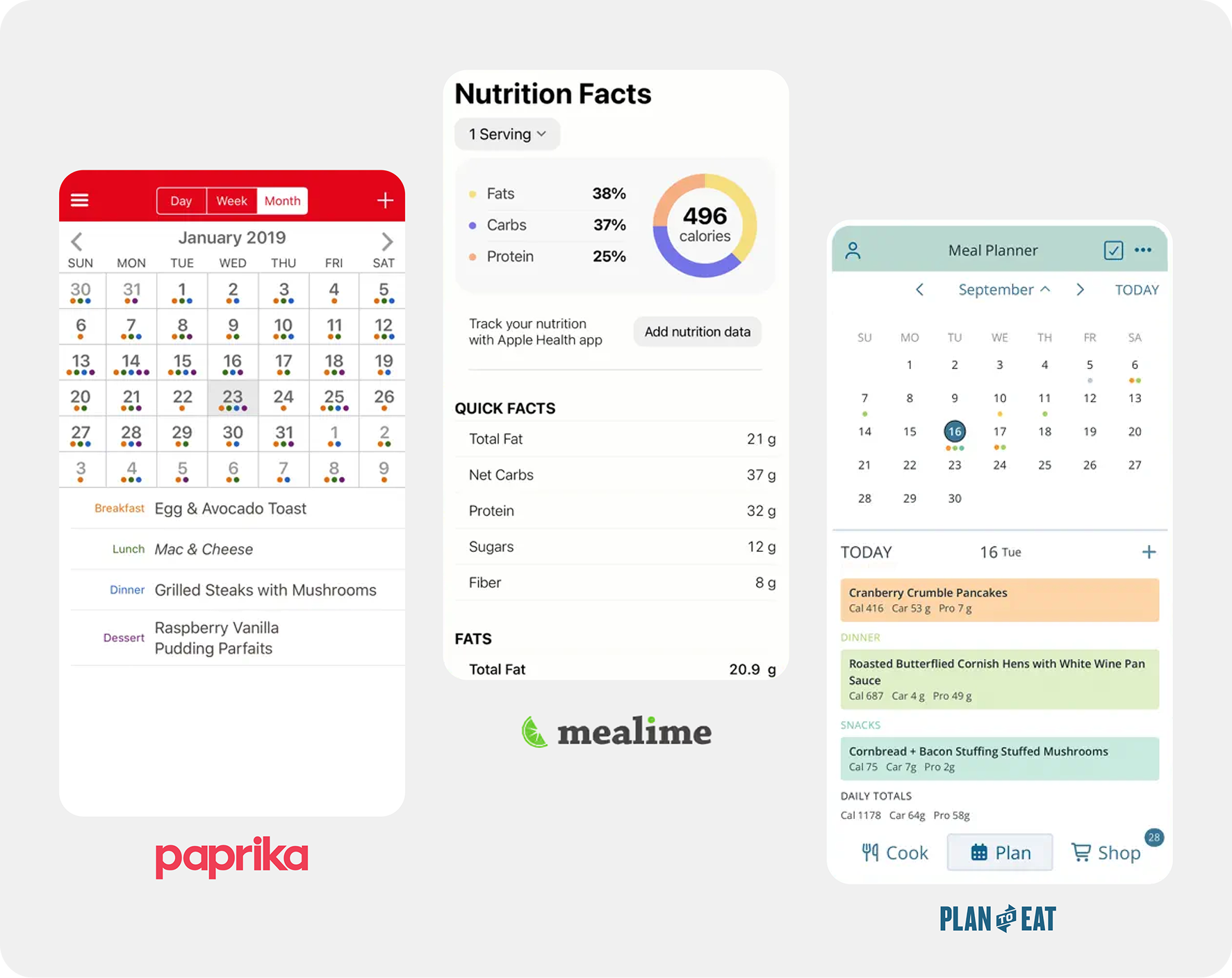
So I looked at what existed. Paprika is a recipe manager with a planner attached. Mealime generates plans for you but gives you little control over the week. Plan to Eat does planning properly but is built around importing recipes from the web, and the week itself is never the thing you look at.
And, honestly, the UI and UX kinda look a bit old and off.
The pattern was consistent: the recipe is the atomic unit, and the seven-day plan is a feature bolted onto it. But when you actually plan food, the week is the object you are working with. That gap is why I stopped building a personal tool and started building a product.
What I owned
Everything — market review, product decisions, interface design, the design system, the functional specification, the implementation, the release, the marketing site, SEO, pricing and support. There was no one else on it.
Decisions
1 — The “week” is the product
The seven-day view is the home screen and the reason the app exists. Recipes are inputs to it, not the destination.
Two things I deliberately did not build:
No calorie calculator. Every competitor in this category eventually becomes a nutrition tracker. I wanted a planner. You can put a calorie figure on a dish if you care about it, and that is enough — anything more turns a five-minute weekly task into a daily logging obligation.
No long onboarding. Most apps in the category open with a questionnaire — weight, height, activity level, goals. I checked what those apps then do with that data, and mostly the answer is nothing: it exists to make the user feel invested before the paywall. I cut it entirely and let people start planning immediately.
2 — Design and write the full specification before touching code
This is the decision the whole project rests on.
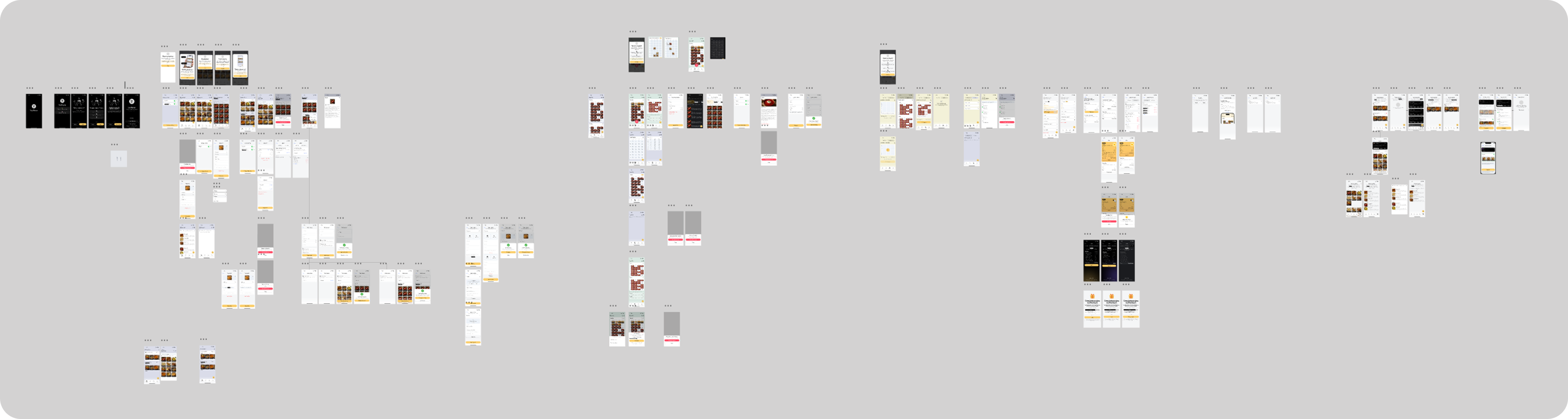
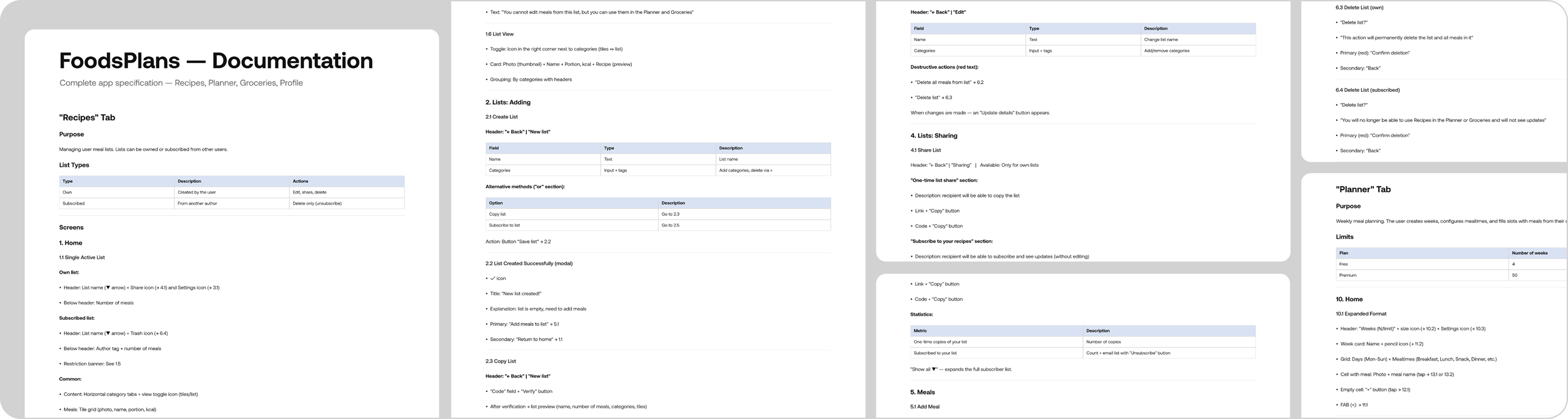
I drew all ~150 screens in Figma first, then wrote a functional specification covering every one of them. Screens were numbered by section — 1.1, 1.2, 2.3, 5.4 — and each entry described what happens on that screen, what the functionality is, and where every control leads. The result reads like this: the “Add” button on screen 5.4 goes to screen 2.3, which starts the dish-creation flow. Unambiguous, and no interpretation required.
The specification lived in its own document, referenced from a root CLAUDE.md holding the architecture, the stack, the feature set and the project conventions. I then built with Claude Code screen by screen, refining each element until it behaved the way the spec said it should.
This is the inverse of how most AI-assisted solo builds go. The common pattern is to prompt forward and discover the product while typing — which produces something quickly and then makes every later change expensive, because no decision was ever written down. Designing first meant the model had an unambiguous target for every screen, and I was reviewing implementations against decisions I had already made rather than making product decisions inside a code editor.
The real work was not prompting — it was context maintenance. The ongoing task across the whole build was keeping the model’s picture of the project accurate: extending the documentation as things changed, keeping CLAUDE.md in sync with what actually existed, and making sure the spec stayed the source of truth rather than drifting behind the code.
A designed interface plus a written functional spec is a working contract between a designer and a code-generating model — and maintaining that contract is a design job.
3 — Launch through storytelling, not announcement
The launch posts were planned, and the first attempt failed. A straightforward “I built an app” post went nowhere.
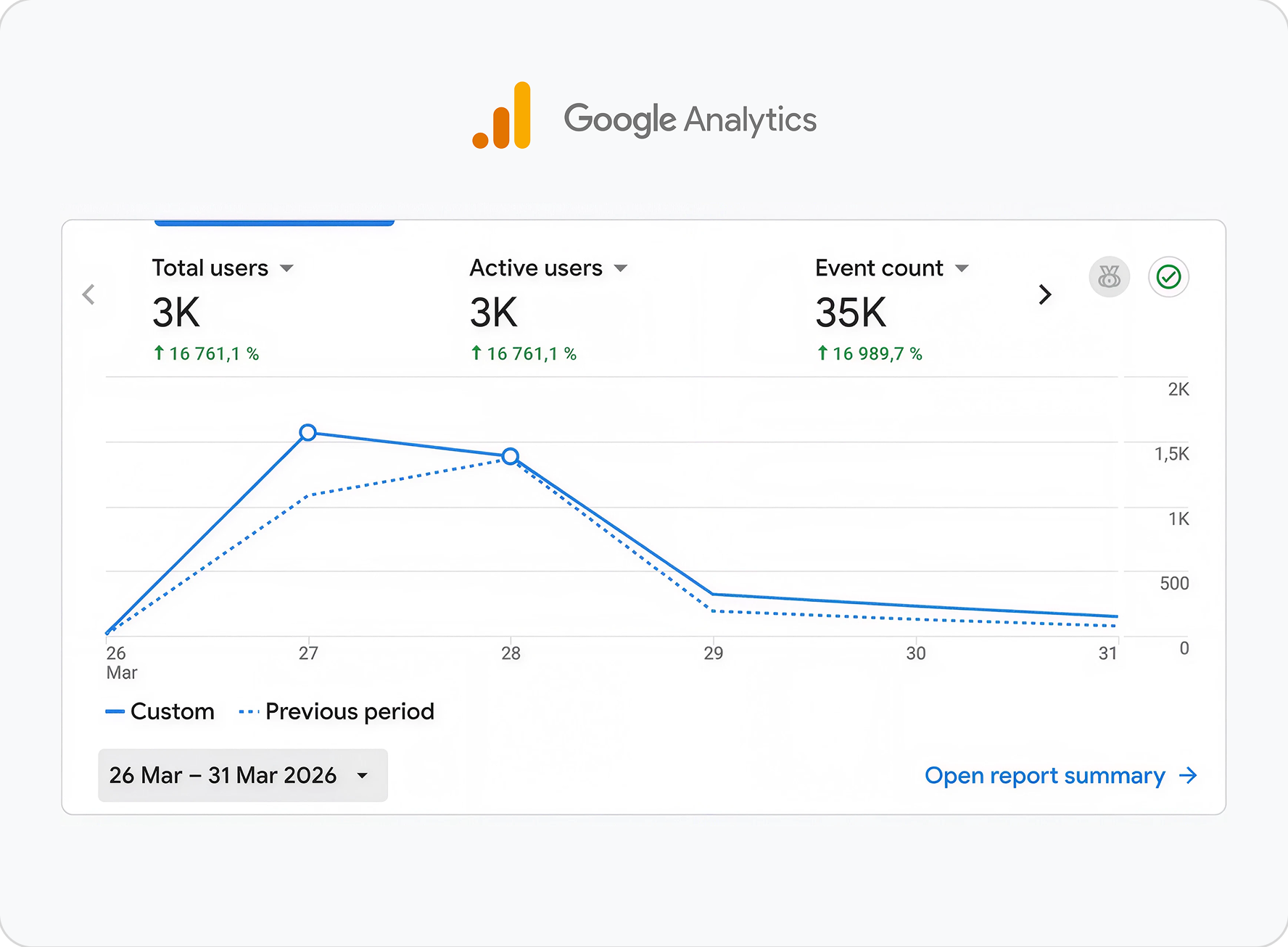
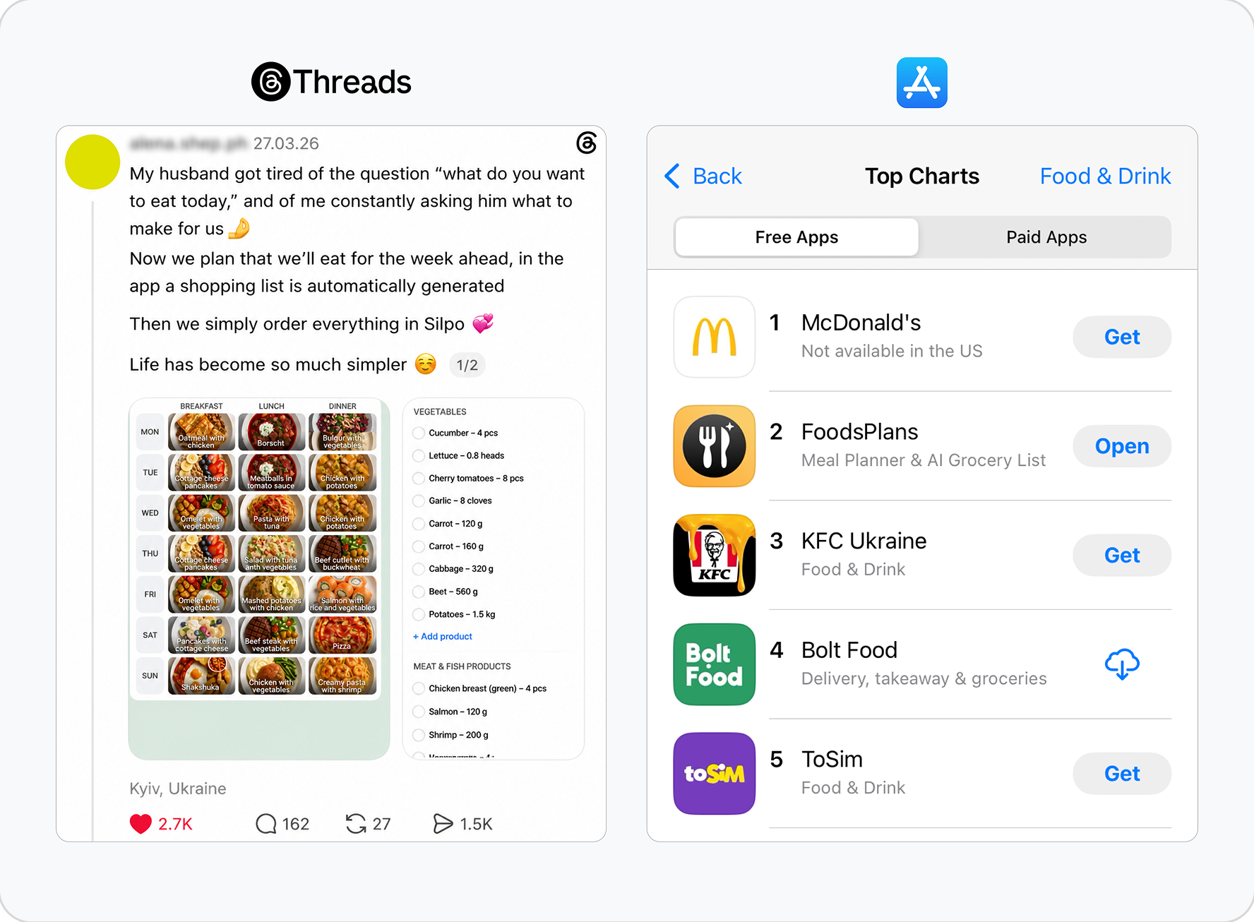
What worked was reframing it: the same launch, published through my wife’s profile, told as a story rather than an announcement. That version got real engagement — comments, likes, and over 2,000 installs in the first two days, which took the app to #2 in the Ukrainian App Store “Food & Drink” category, behind McDonald’s.
No paid acquisition at any point. The lesson was cheap and specific: the product was identical both times — the framing was the entire difference.
4 — Support as a feedback loop
Instead of an email address or a helpdesk tool, the in-app contact form routes straight into a Telegram bot. Users write, the message reaches me instantly, and I answer as support.
About 20 conversations so far. Two of them changed the product:
Payment confusion
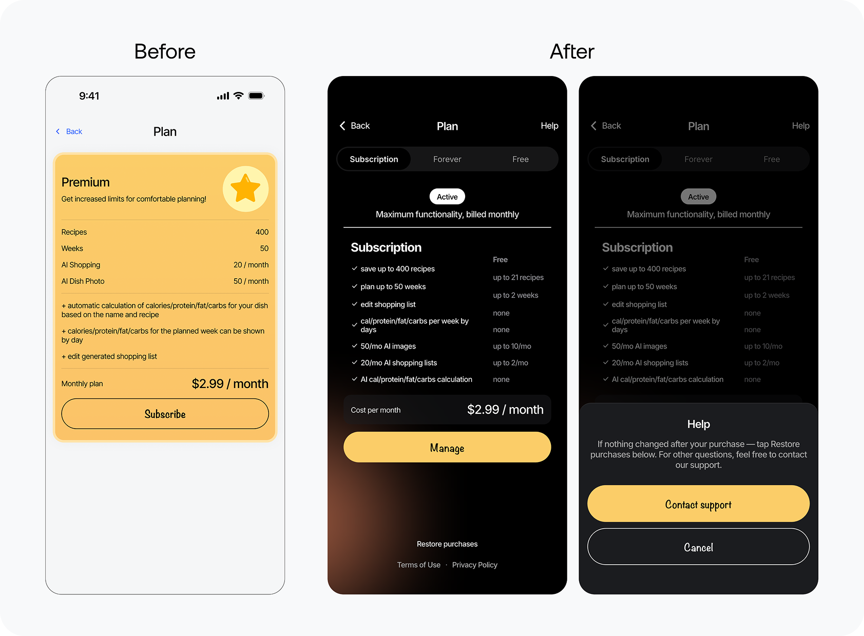
The most common issue by far was subscriptions not activating immediately after purchase, and people assuming they had paid for nothing. I added a Help button directly on the purchase screen with a short explanation of what to do, while keeping the support channel available for anything else.
The Forever plan
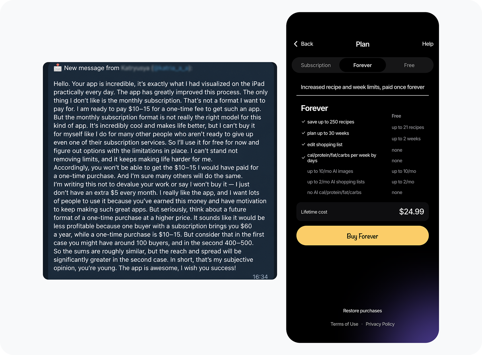
The app runs on a $2.99/month subscription. A user suggested a one-time purchase as an alternative, and I shipped it — you buy once and keep the full feature set permanently. It exists because someone asked for it, not because it was in my pricing plan.
Neither change came from my own opinion about the product. Both came from the channel, which is the argument for having one.
5 — An indexed recipe catalogue as the long-term channel
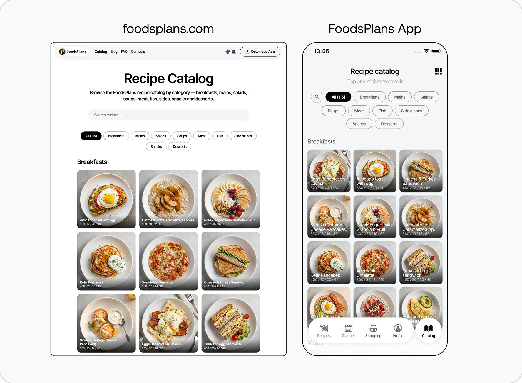
The marketing site carries a blog and an open recipe catalogue — 119 pages, each recipe its own indexable page, in Ukrainian and English. Recipes render identically in the app and on the site, from the same source.
The catalogue started as something else. The original idea was public sharing: users publishing their own dishes for everyone. It didn’t get a meaningful response, so I cut it back to a curated set of FoodsPlans recommendations. The simpler version is better — less empty state, less moderation, and a clearer reason for the page to exist.
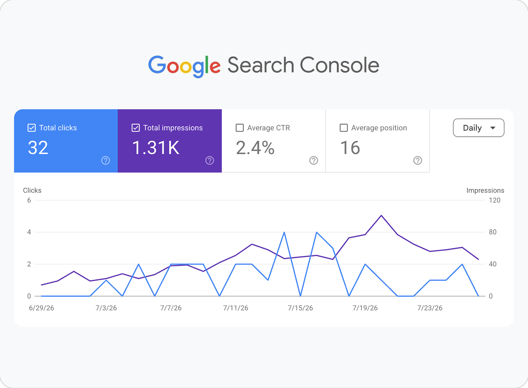
Current search performance: ~1,500 impressions and 32 clicks per month, trending slowly upward. Small, and honestly reported — the launch was a spike, and this is the channel meant to still be working after the spike is over.
Outcome
Covered by Ukrainian tech press — dev.ua, retailers.ua, galera.news
What I’d do differently
I treated the release as the finish line. It was the moment of maximum attention and maximum information, and I was set up for neither.
The four things below are not four separate mistakes. They are the same mistake seen from four angles.
No onboarding. The spike hit a version that was still effectively a test build. There were no introductory screens, and the concept wasn’t self-explanatory to someone opening it cold. People downloaded, didn’t understand what they were looking at, and left. I’ve since added the onboarding that was missing, but the 2,000 people from that first weekend are not coming back.
No instrumentation. This is my biggest regret because I can’t fix it now. I had no product analytics during launch — Amplitude was added later and tracks about 1,100 events. So my explanation for why ~4,000 downloads dropped to ~350 monthly actives is just a hypothesis. I can guess where users dropped off, but I can’t prove it. That cohort is unmeasured and lost.
No Android. People asked for it directly in the launch comments — the demand was visible in real time. It shipped about a month later, after the attention was gone, and Android accounts for roughly 100 of the ~4,000 downloads. Almost the entire audience is iOS, and that’s a consequence of timing rather than platform.
Nothing to do on day one. A new user faced an empty week. Had the recipe catalogue been live at launch, they could have saved a batch of dishes in a minute and started planning straight away. It shipped later.
The generalisable version: instrument and finish the product before you create the demand. Attention is the one input you can’t re-run.
Next case
BlockRiver — designing a regulated settlement platform before it has users →Contact
Looking for a product design role in Web3 or fintech — remote.
If that’s what you’re hiring for, write to me.