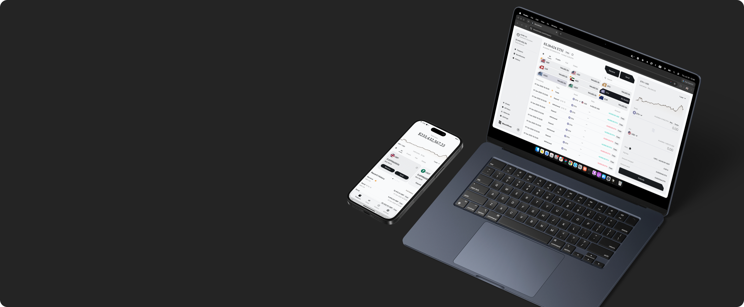
 BlockRiver
One screen, one job
I took over a rough demo in 2022 and spent a year deciding what each of its screens was actually for. Four companies licensed the result. The home screen has since been rebuilt to a different principle — and the launch is what will decide which of us was right.
What the product does
Large companies need to move large sums to each other — hundreds of thousands, sometimes millions, in fiat and crypto.
Doing that on a public exchange moves the price against you. BlockRiver settles transfers directly between parties—no order book, no market impact, and the transaction stays private.
The interface user is not a trader but an accountant or finance operator at a large company, moving money their business depends on, using a screen they use occasionally.
The design problem: high stakes, low frequency, no trial learning. If the interface misleads, money is lost or transfers take hours instead of minutes.
Every screen of the platform and its companion mobile app has been mine since the first version — the flows, the interface, the design system, and the argument for both. There has never been another designer on it.
How it got here
One codebase, three names, and a different customer behind each of them.
2022
WizWiz, a working draft
I joined a small team holding draft work under a test name — software that put traditional finance and crypto into one interface. We rebuilt it over the following year, and it became Marionette.
2023–2025
Marionette, a licensed product
The business sold software to companies. Four licensees launched it under their brands, including an African crypto exchange. We redesigned and extended the product to meet their needs, funding the team.
2025 onward
BlockRiver, institutional OTC
A licensee adapted the interface and resold it. The team partnered with them for European market access, creating BlockRiver for direct settlement between companies, registered in London in spring 2026.
For a designer this is a specific kind of problem. The customer changed, the business model changed, the primary screen changed — and it all had to happen inside one codebase without starting over. Most of the decisions below are consequences of that.
What I changed
1 — The wallet page
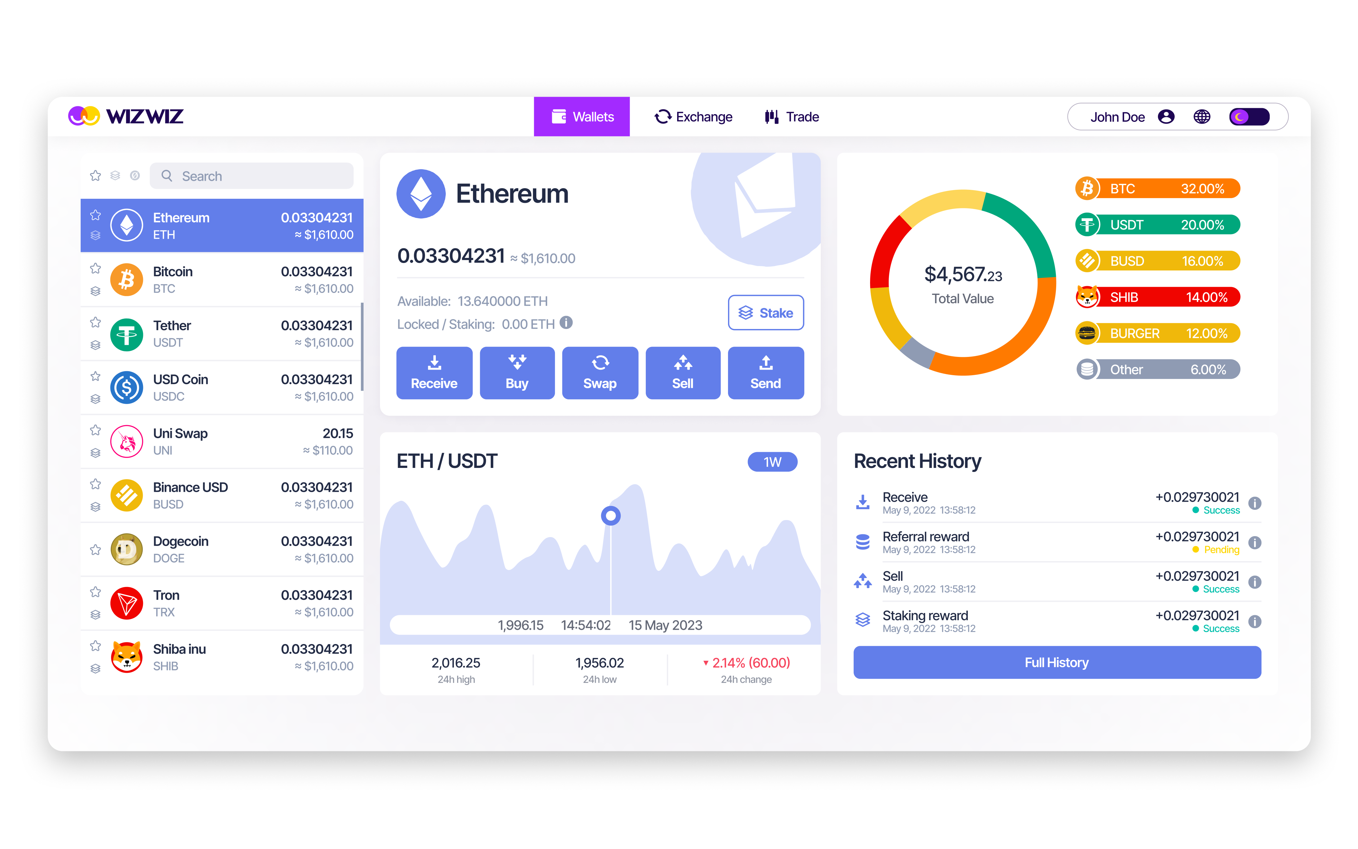
The WizWiz wallet held a total-portfolio block inside a currency-specific interface. Pick a currency and most of the page responded — but that block stayed universal. One screen, two contradicting scopes, and nothing to tell the user which was which.
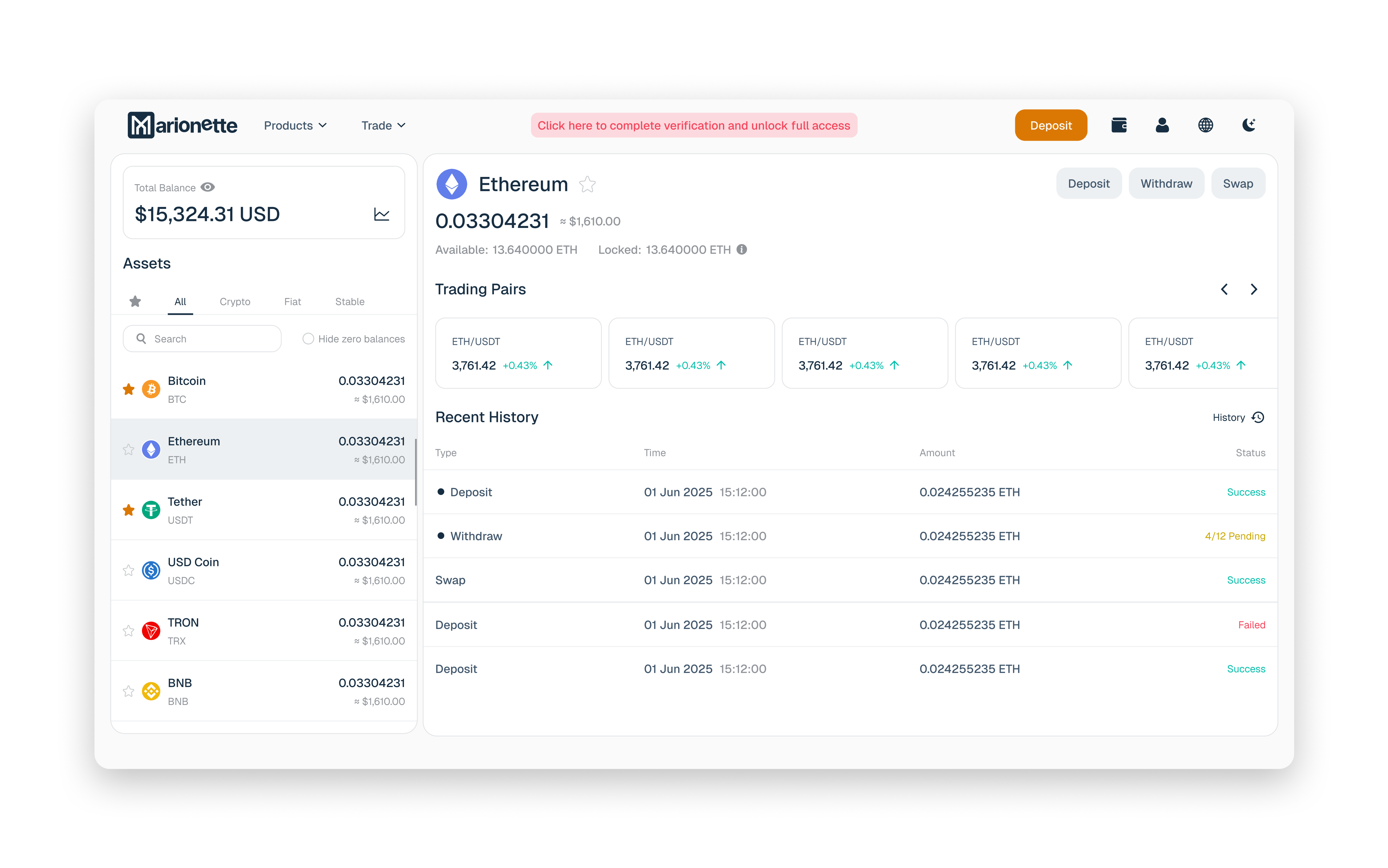
I moved the portfolio out and split the page into two blocks that each mean one thing: currency selection with the total balance above, and everything you can do with the selected currency below.
One anchor, one reading order. Remember this screen — it comes back at the end of the case.
2 — Deposit and Send as pages, not modals
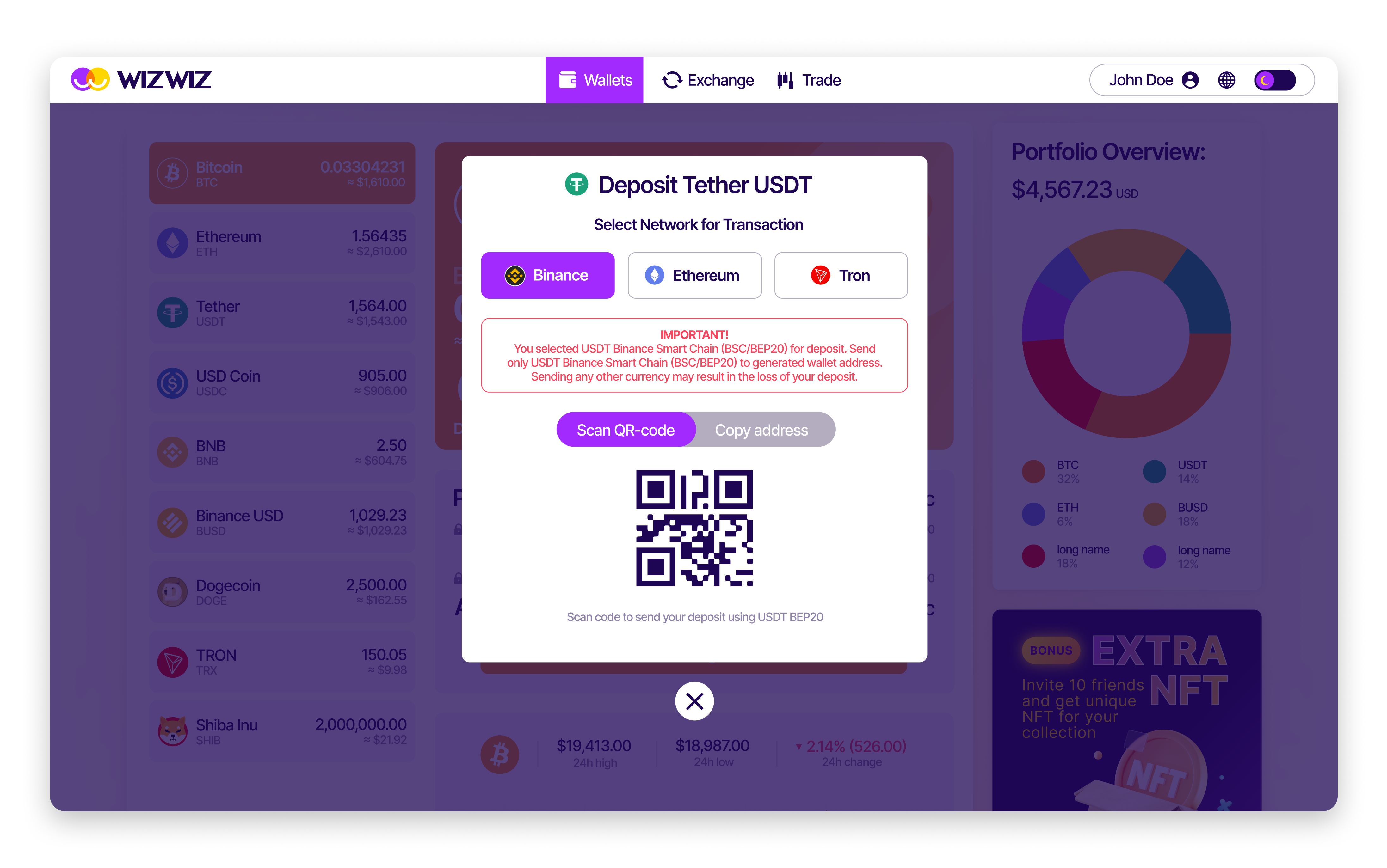
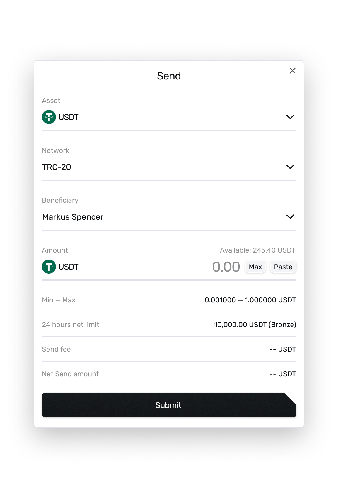
Both flows ran inside modals. A modal is a good container for one decision and a bad one for a sequence: no room to explain, no way to show where you are, and an accidental dismissal costs the whole entry.
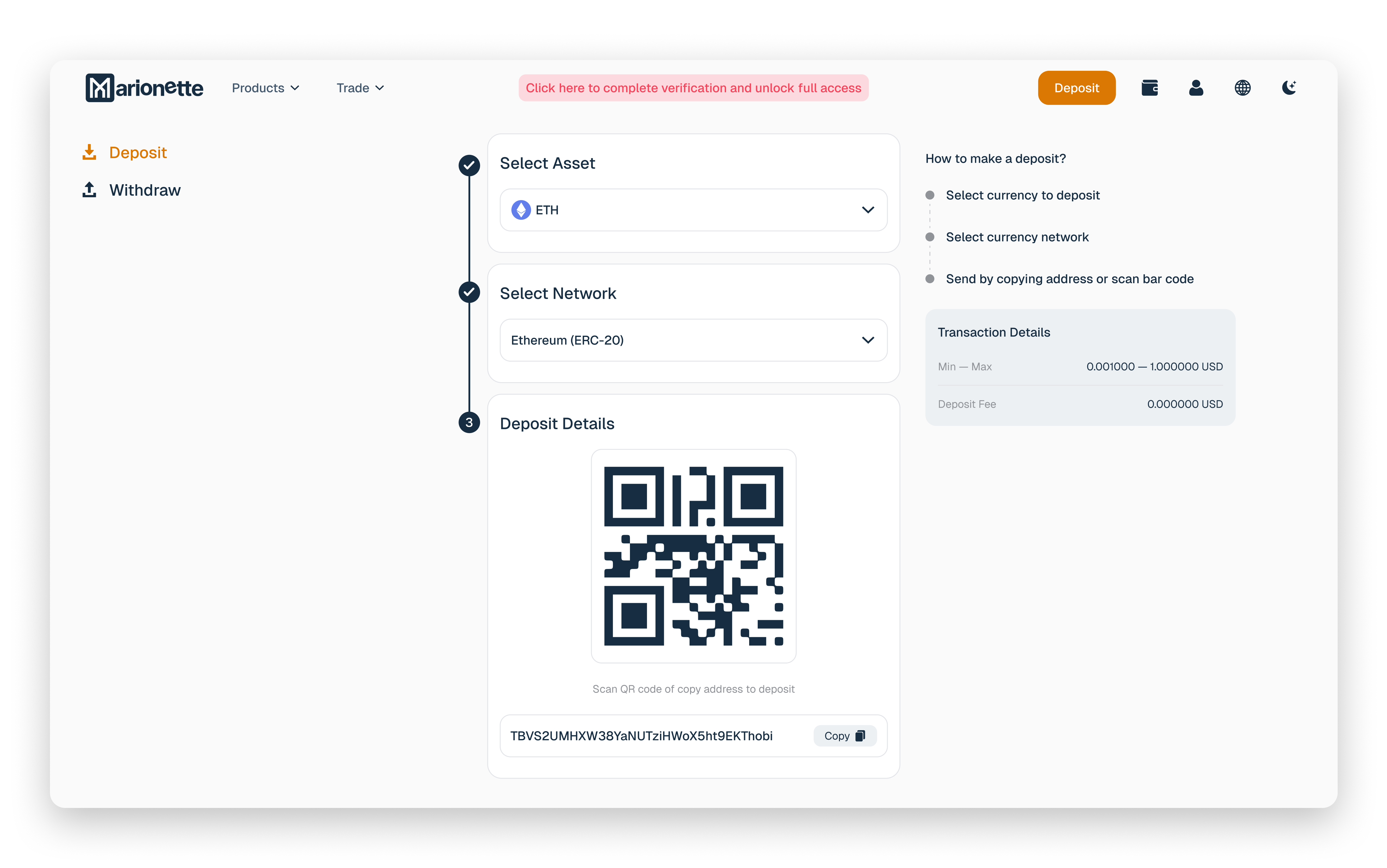
I gave each flow its own page with a stepper, so every step is named and the number of steps left is visible. These are the two operations the product exists for — they earned the room.
The same argument decided the settings screen a few weeks later: regrouped, and with an explanation next to each control rather than a tidier layout.
3 — Stripping the authorisation flow
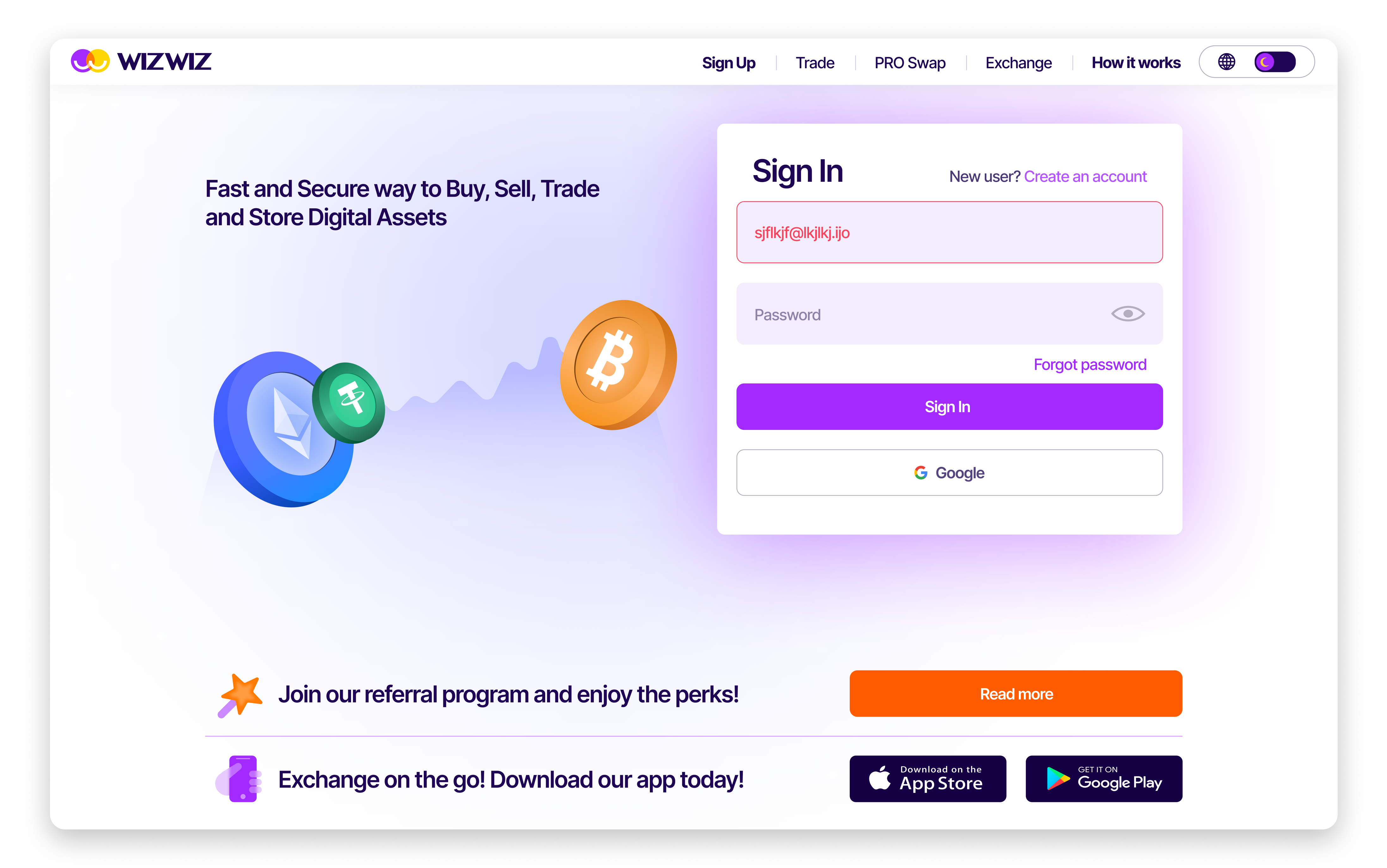
The WizWiz login carried a lot that was not login: blocks of explanatory text, an additional large content block, a full footer. It read as a marketing page with a form somewhere in it.
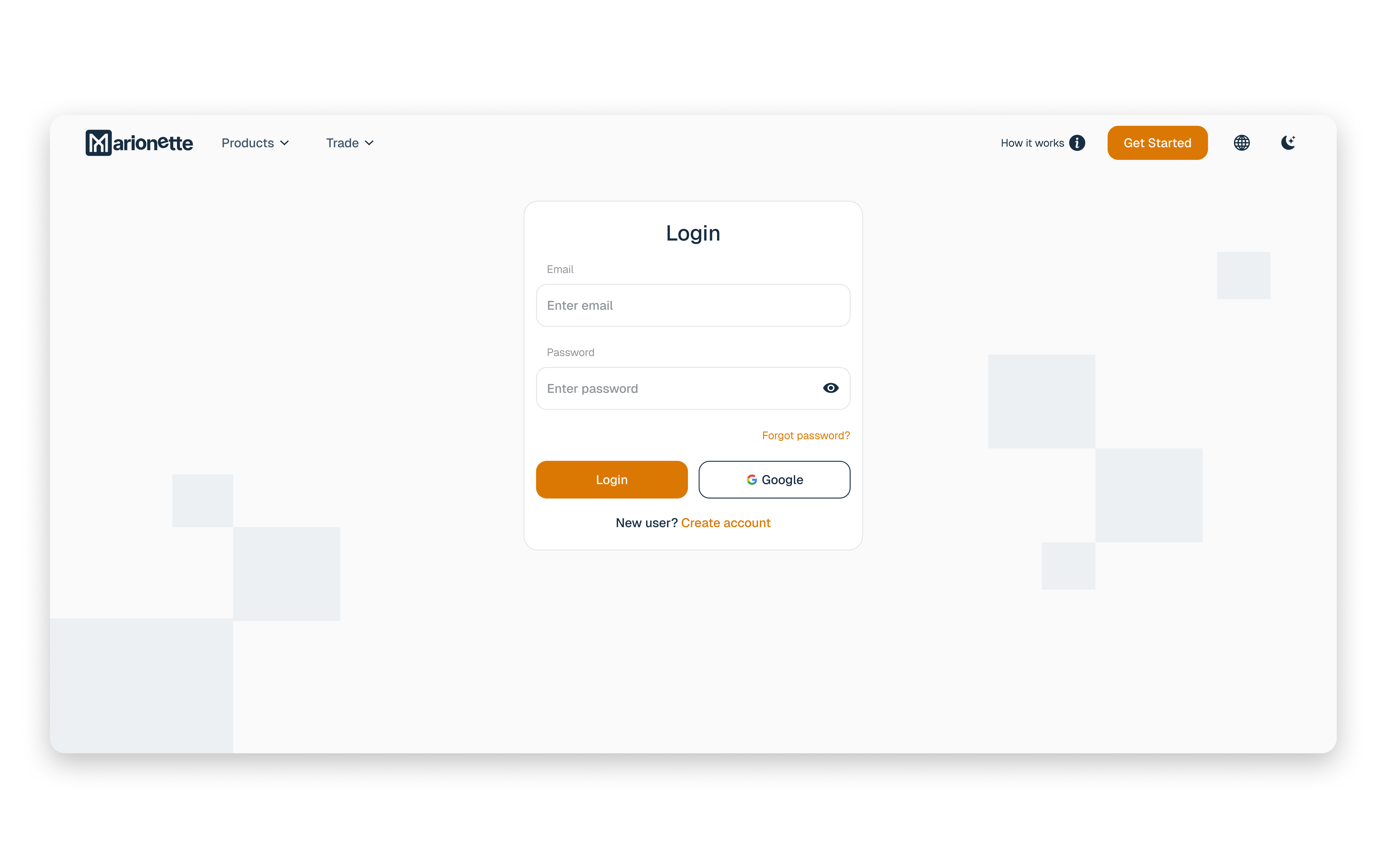
I cut it to a single block containing only the fields required to get in. Nothing to read, nothing to scroll past, no decision to make other than the one you came for.
This is the clearest before/after in the project, and the one place where the argument was won purely on the merits.
4 — Trading, extended and then retired
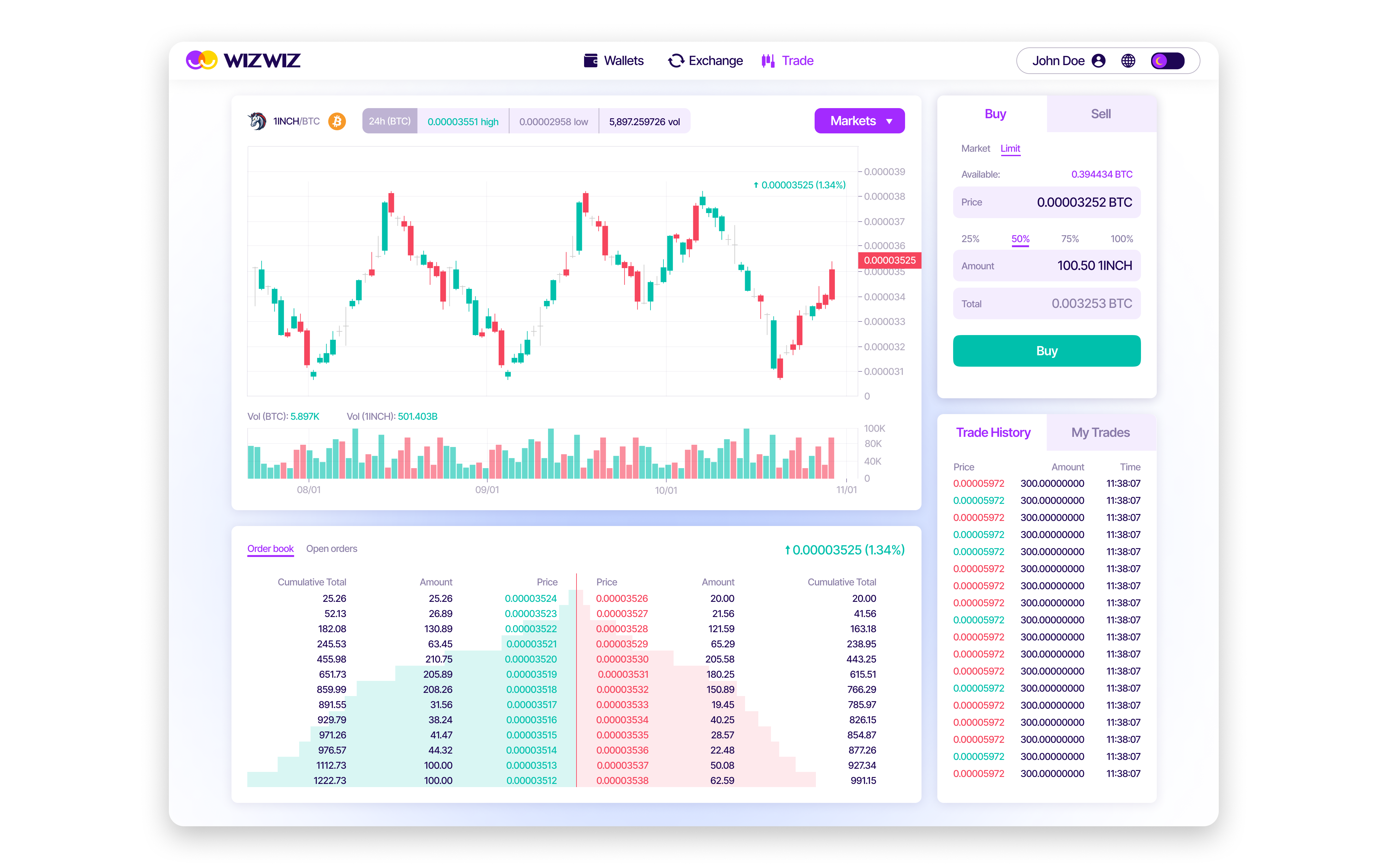
Exchange-style trading was in the draft from the start, and it was the original bet: the product that put traditional finance and crypto in one place was supposed to be a place you traded.
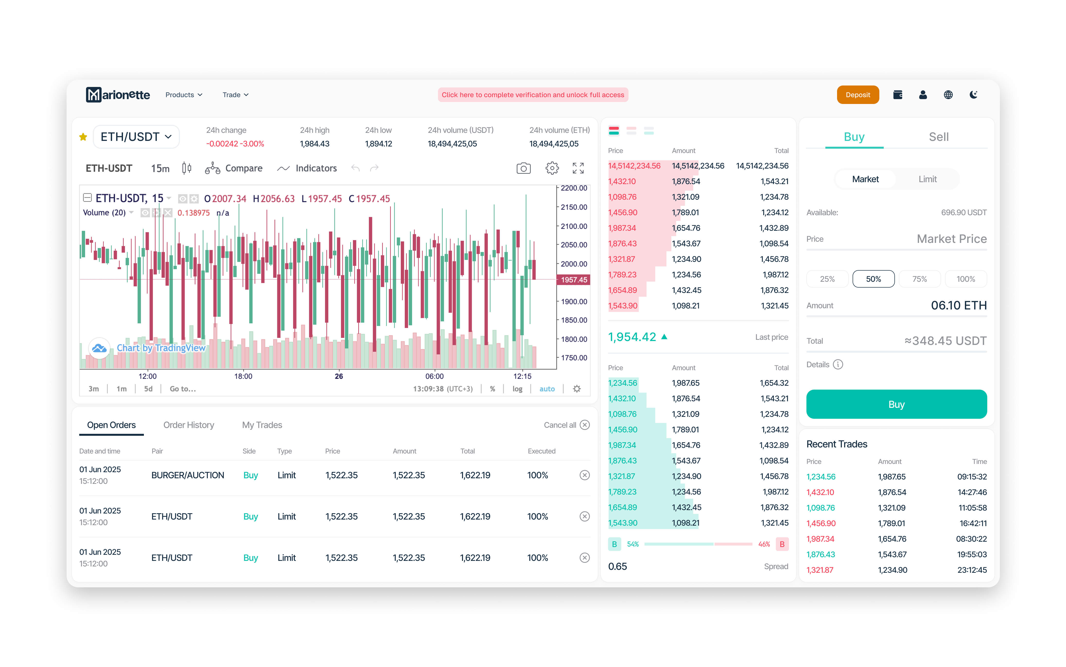
We extended it — more of what an exchange interface actually has to carry. It is also the only part of this case that no longer exists.
When the business moved to OTC settlement, trading stopped being the product and the module was cut rather than finished. I am showing it because it was real work and because a case that only contains the parts that survived is not an accurate one.
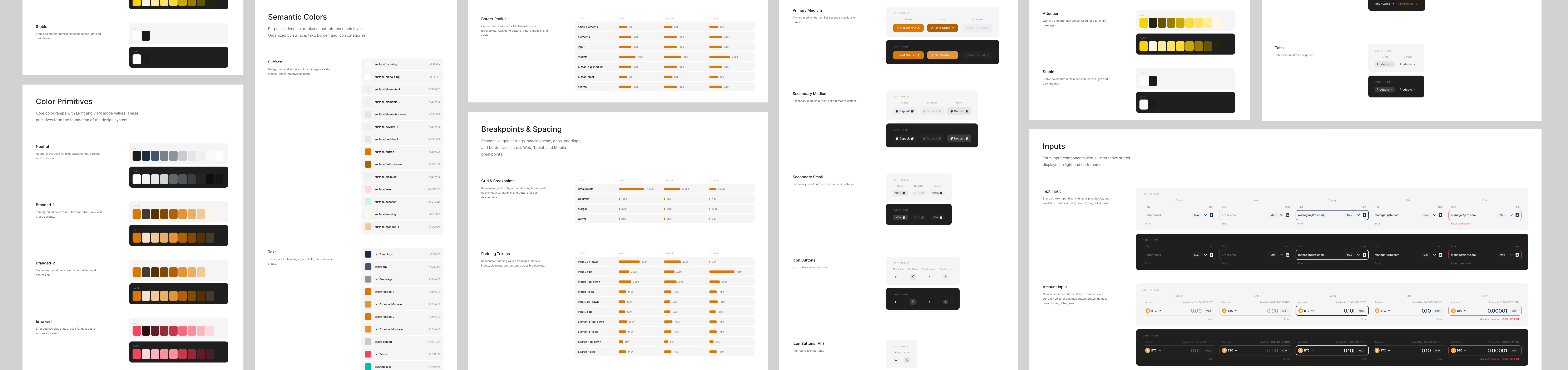
5 — A design system
For the first two years there was not one. There were fonts and colours; components were not managed globally, and every licensee rebrand meant redoing work by hand.
In 2024, I built a system with design tokens—type, spacing, color, and components unified and shared with the front end. With multiple rebrands and another identity change coming, this was a survival need, not just preference.
What the product does today
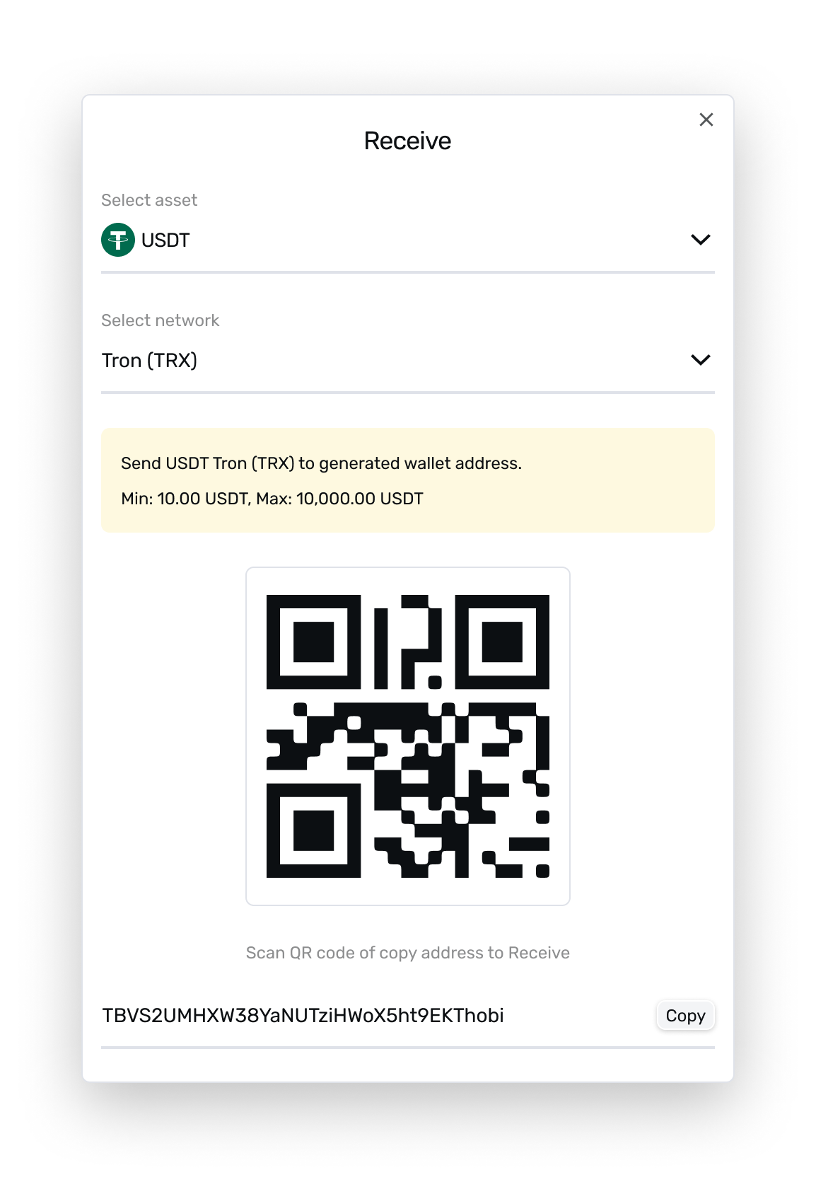
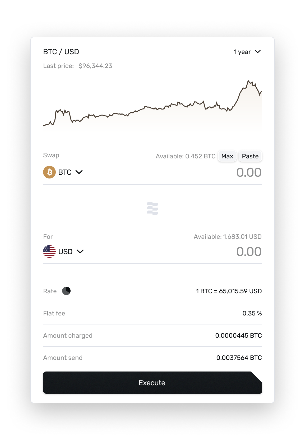
Deposit, Swap and Send. Everything else is settings. Six currencies, fiat and crypto in the same account, and a transfer that is fast on the front end but can take up to an hour to settle behind it — so every operation reports its state in Recent history rather than leaving the user guessing.
The same screen, three years later
The wallet page is still the platform home screen, and it is the part of the product I would most like another pass at. This version was built to the partners’ specification rather than mine.
What I had built in 2022 worked from a single anchor: you pick a currency, and everything resolves from that choice — top to bottom, one reading order.
The current version places the currency selector in the middle of the page. Choosing a currency updates the region below it, leaves the region above it unchanged, and separately updates the Swap block to the right. Selection ends up with three different scopes — the same tension I took out of the WizWiz wallet, arriving from the other direction.
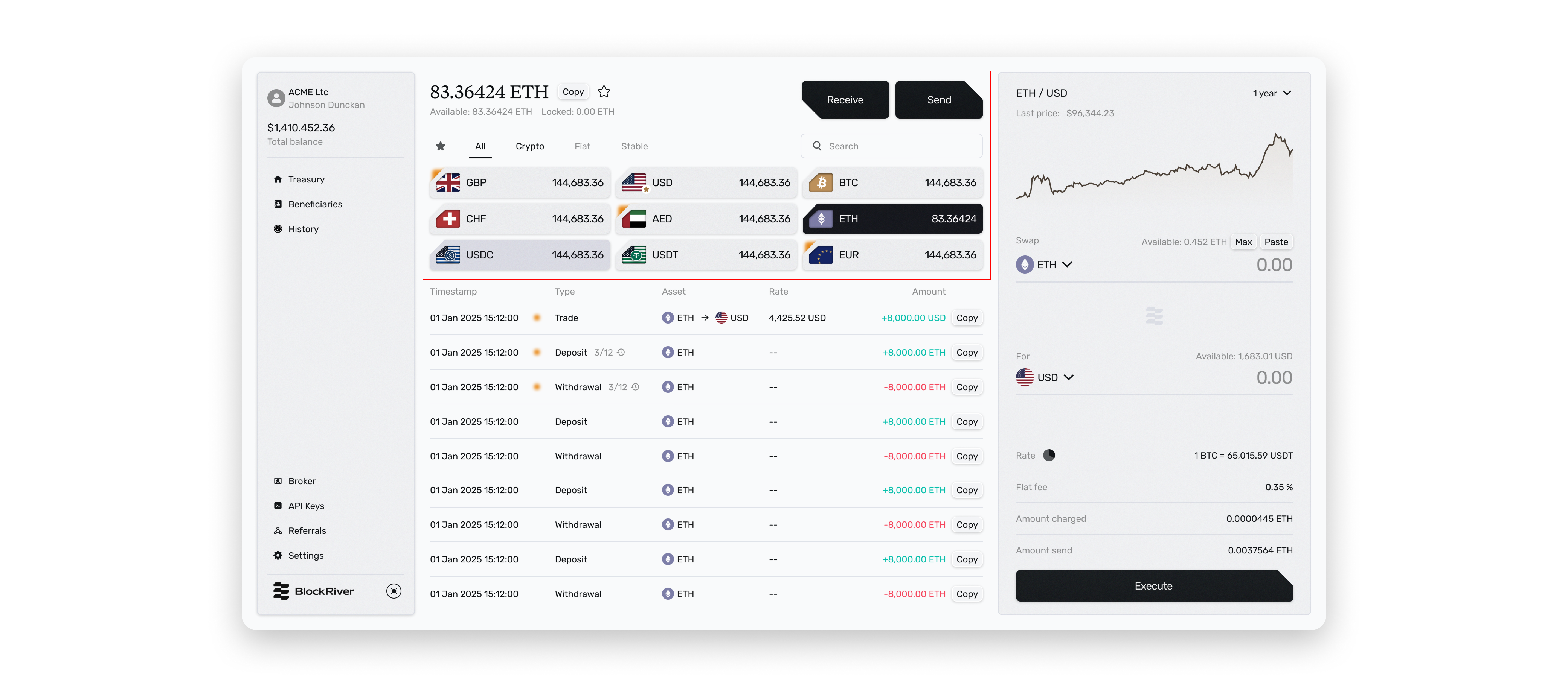
The partners’ position was that they know their audience, and that is a fair claim to make. Mine was that a screen where one control has three scopes teaches nothing on first use — and for an accountant who opens this monthly, first use is most of the use.
Their version shipped. I am currently designing the big brokerage part, which extends the same surface, and I plan to use it to revisit the wallet page — this time with observation rather than argument.
Status, honestly
The software has been in production for four years, under other companies’ brands, as a licensed white-label product. BlockRiver as its own entity is not launched yet: registration came through in London in spring 2026 and the platform is being prepared for release now.
Which means I have never spoken to an end user of anything I designed here — despite four companies running it live. Requirements reached me second-hand, through the partners and our CTO. I did not read the primary regulatory documents; I worked from what was relayed.
The brokerage module is where that changes. Four licensees have this software in production with real customers, and thirty minutes with three of their operators is a request I can make. Watching one deposit, one swap and one send is a smaller thing than a research programme, and it is the only thing that would settle the wallet question.
Next case
FoodsPlans — a meal planner I designed, specified, built and shipped alone →Contact
Looking for a product design role in Web3 or fintech — remote.
If that’s what you’re hiring for, write to me.